As we edge closer to 2025, the anticipation for Pantone’s Color of the Year continues to grow. Over the years, these selections have reflected global emotions, cultural shifts, and design trends. For 2025, predictions are pointing towards shades that balance futuristic allure with grounding qualities. But what might this year’s defining hue be, and what does it represent? Let’s get into our predictions for Pantone Color of the Year for 2025.
The Role of Colors in Defining 2025

Color experts suggest that 2025 will highlight tones that offer both reassurance and inspiration. Deep, immersive hues like Future Dusk—a blend of blue and purple—are gaining momentum. This celestial tone symbolizes a blurring between reality and fantasy, speaking to our evolving digital and physical experiences.
Additionally, shades such as Aquatic Awe and Mapped Blue hint at our increasing focus on wellness and environmental harmony. These tones evoke calm yet encourage dynamic creativity, perfect for grounding spaces while inspiring innovation.
Influences Behind the Predictions

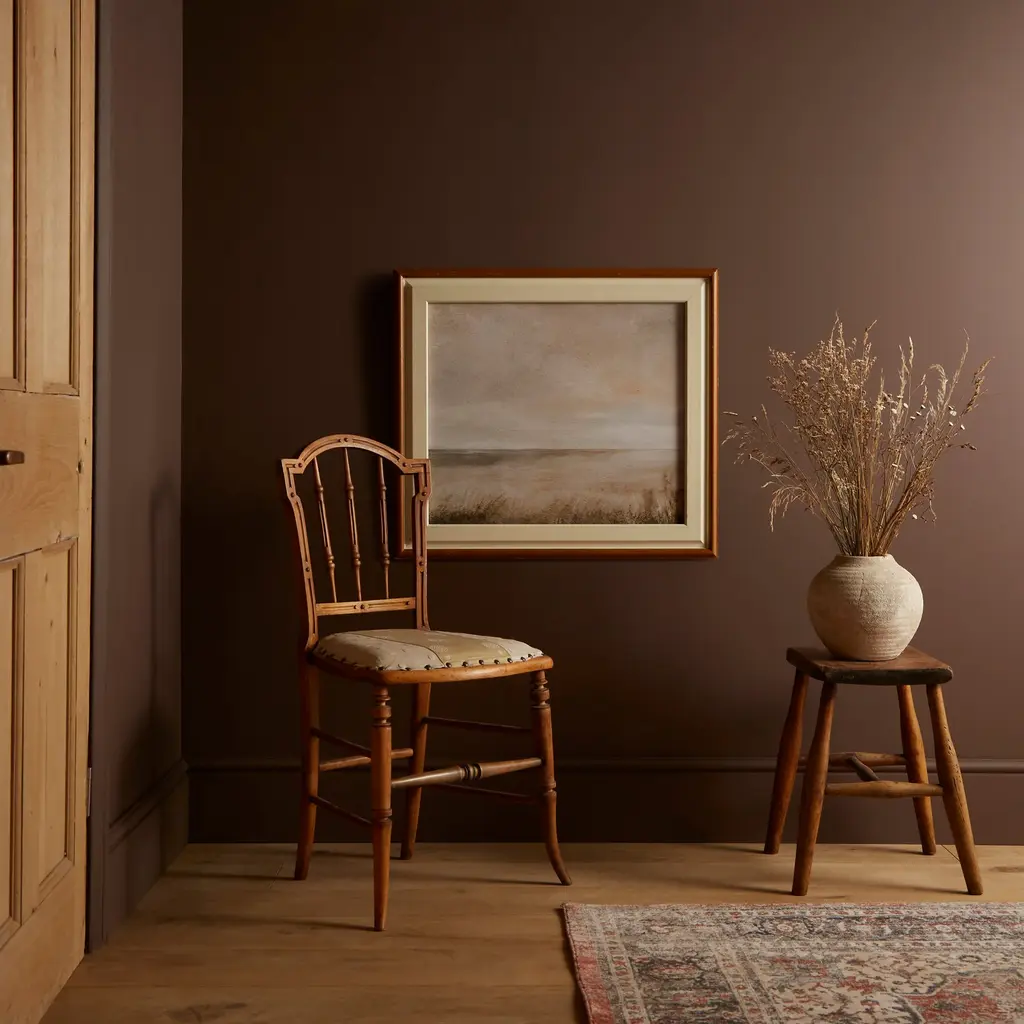
Pantone’s choices often mirror societal moods, and 2025 is no exception. The predicted colors echo themes of stability and resilience amid a world of rapid change. Earthy hues like Elderton (a versatile, warm brown) reflect our need for timeless, stable designs that feel cozy and dependable.
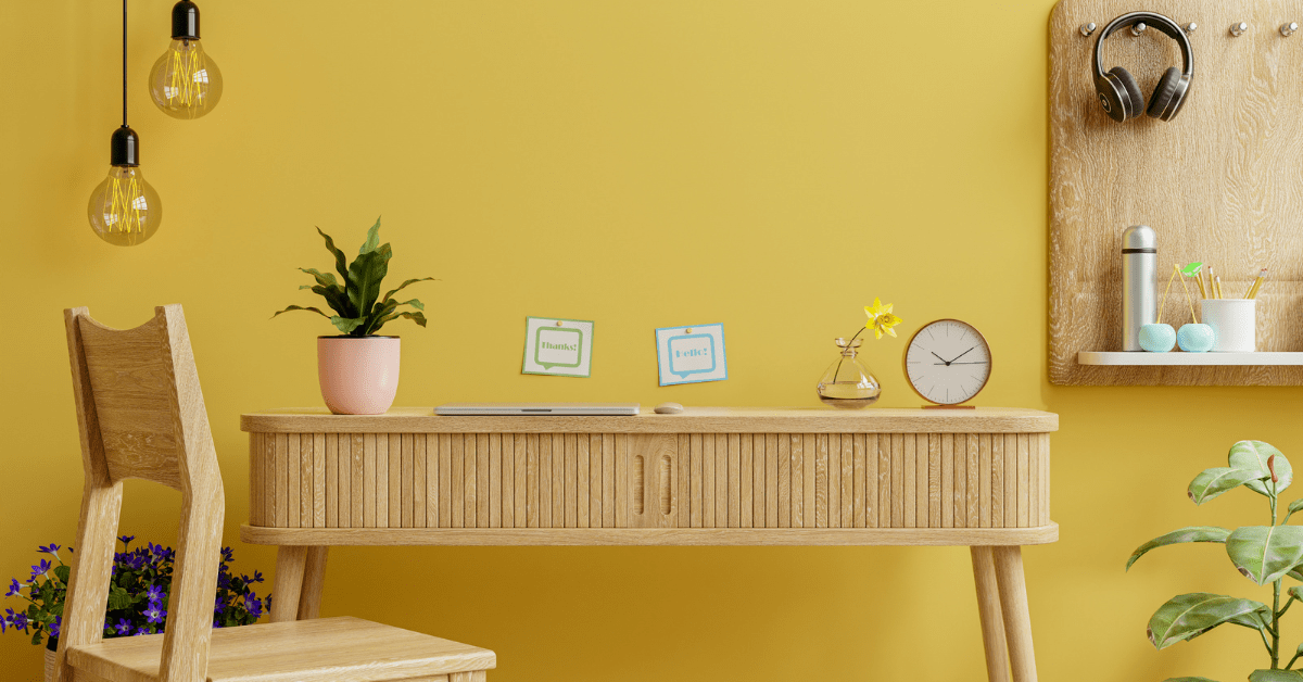
On the other hand, vibrant selections such as Ray Flower (a cheerful yellow) and Sunset Coral represent optimism and joy, ideal for brightening interiors and fostering uplifting atmospheres in communal areas.
Bold Interiors: Designing with Saturated Hues

Dark and moody tones are perfect for dramatic home settings. Future Dusk, for example, creates striking visual depth when used on feature walls, ceilings, or even statement furniture. Pair it with lighter neutrals to balance its intensity and prevent overwhelming the space.
For a cozy yet modern ambiance, shades like Elderton, a rich brown, bring warmth and sophistication. This versatile hue complements natural materials such as wood or leather, creating timeless designs perfect for living rooms or home offices
Creating Tranquil Spaces with Calming Blues

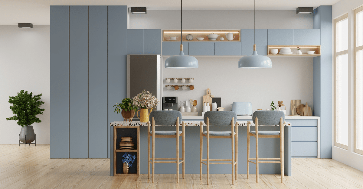
Blues like Mapped Blue and Aquatic Awe offer serenity, making them ideal for bedrooms, bathrooms, or meditation areas. These shades evoke the calmness of water and sky, helping homeowners achieve a retreat-like feel, which could also work for a minimalist kitchen as well.
Consider pairing these hues with organic textures—think linen curtains or jute rugs—and soft lighting to enhance their soothing qualities. The adaptability of these blues allows them to work seamlessly across traditional and modern design schemes, especially when paired with natural materials such as wood.
Related Articles
The Pantone Color of the Year for 2025 will undoubtedly shape how we interact with our homes and each other. Whether through immersive purples, grounding browns, or uplifting yellows, this year’s palette invites us to create spaces that resonate emotionally and adapt to our ever-evolving lifestyles. As we await the final announcement, one thing is clear: the colors of 2025 will be as versatile and transformative as the year itself.
Turn your house into the home of your dreams. Our newsletter provides you with design ideas and decor trends. Subscribe now to start your journey to a stunning home! Click here to subscribe now.
